"Proportion is the good breeding of architecture. It is that something, indefinable to the unprofessional eye, which gives repose and distinction to a room: in its origin a matter of nice mathematical calculation, of scientific adjustment of voids and masses, but in its effects as intangible as that all-pervading essence which the ancients called the soul." Edith Wharton

Very nice fix, above, to scale, proportion, flow. Yet there is an added design element not abiding to the rules of scale/proportion and landed onto the terrace from Mars.
.
Which is the good fix? Which is the ill conceived addition?
.
First, brava to the terrace design flanking the entire back of the home, flowing in vanishing threshold from every window/door.
.
Yet, that is not the 'good fix'. Adding the checkerboard 'path' to the terrace is the 'good fix', a genius fix. I sense it was not in the original design, yet makes the original design magic. A nice reminder of, 'A landscape can be installed in a day, a garden takes a lifetime.' Many layers of nice thought, above.
.
Yet one zone, above, is awkward.
.
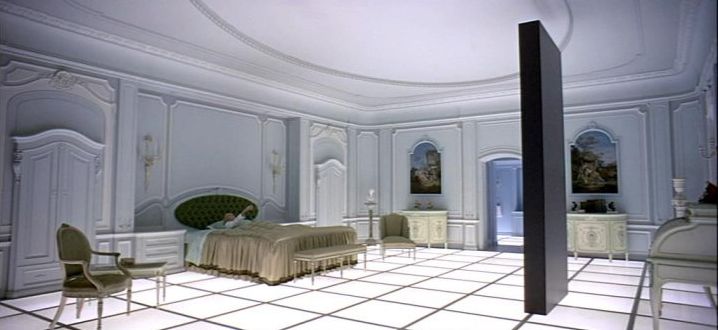
Have you nailed it yet? It was more common at the front end of the trend, but has tamed itself in recent years. The fireplace. Oh my. It's a fireplace with a house, not a house with a fireplace. Fireplace monument to the gods. The monolith floating in space at the end of 2001: A Space Odyssey, ca. 1968. A fireplace with no soul, merely a good salesman.
.
Garden & Be Well, XO T

Pic, above, from the movie, 2001: A Space Odyssey,
here. Remember well, and not understanding seeing 2001 at its premier, not far from the Astrodome & Gulfgate Mall. Oh my the joy of growing up shopping there, especially, Sakowitz. Their clothes & shoes, and their fabulous decorations at Christmas. Neiman's was a wannabe back in those days ! Odd to learn, just now, below, Gulfgate housed some of NASA before it could be completed for workers. Helping mom choose dad's crypt the salesman shared his story of painting NASA buildings as fast as they could because NASA workers were sited all over Houston/Pasadena awaiting their buildings.
.
Gulfgate Kiddieland opened in the mall on March 21.
[4]
In the early 1960s, while the
Manned Spacecraft Center (MSC) was under construction in the
Clear Lake area,
NASA personnel opened temporary offices in center in about 3,000 square feet (280 m
2) of floor space donated for the purpose by the Gulfgate management. MSC had a continuing operation there until additional office, engineering and laboratory space could be leased and made ready for occupation. Operations at the Gulfgate offices were largely concerned with procurement, personnel and public affairs.
[5]
The shopping center was enclosed around 1967 and, after years of decline and competition, shuttered in 2000. In 2001 the original mall and the former
Mervyns (across Woodridge) were demolished and redeveloped into a
strip mall configuration, anchored by
H-E-B,
Best Buy,
Office Depot,
Marshalls, and
Lowe's "


